
Recently, we’ve undergone an overhaul of our Keycloak authentication pages for Singlestore Helios's Portal.
Our aim was not just a cosmetic upgrade; it extended to aligning the development process more with the rest of Singlestore Helios, which is built with React and TypeScript, and uses our internal Fusion Design System's components. This blog post delves into the meticulous process of analyzing and optimizing the bundle size of our new authentication pages, and exploring various techniques that were instrumental in this process.
Background
To bring the Keycloak theme in line with the broader architecture of the Singlestore Helios frontend, we chose to adopt React and TypeScript. This took us to Keycloakify, a handy tool that converts React components into the Freemarker template files required by Keycloak.
By default, Keycloakify is intended to be used with Webpack and plays nicely with React apps made with create-react-app, but we have a fairly complex Webpack configuration for the Singlestore Helios Portal. This prompted a shift to Vite for the new theme — a decision that not only streamlined the build process, but also added the benefit of enhanced build speed.
Bundle analysis
Our optimization journey kicked off with a thorough analysis using vite-bundle-visualizer. While recognizing its limitations (since it doesn't account for lazy-loaded components or specific page-component associations) it still provided a valuable starting point to analyze our bundle size.
Internationalization: Trimming unnecessary files
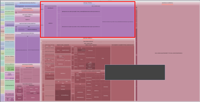
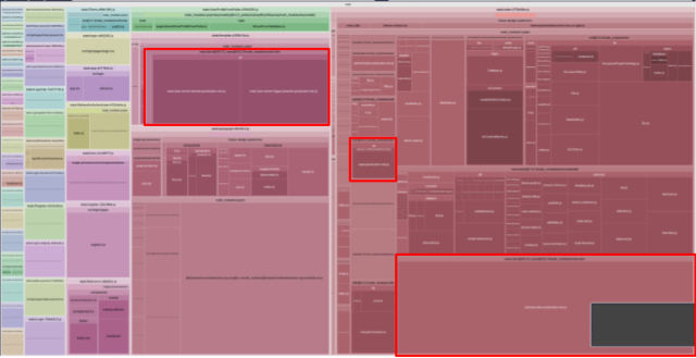
An initial observation in the bundle analysis was the surplus of translation files related to internationalization.
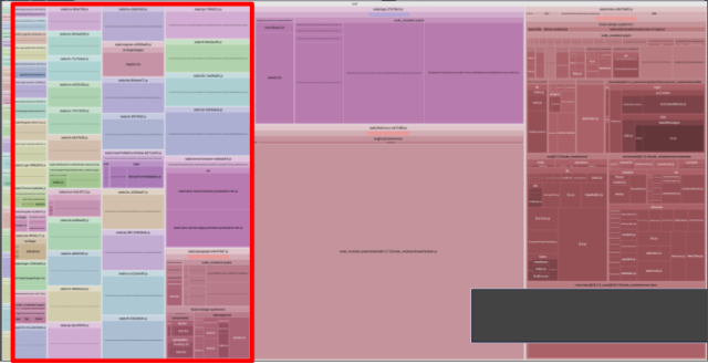
We do not use any translations. In fact, we do not use internationalization at all across Singlestore Helios yet. While internationalization is an important part of creating an app, this is something we haven't prioritized. By stubbing the i18n functionality that is built into Keycloakify, we can significantly reduce the bundle size.
// copies the built-in generic i18n type but avoids importing other things. When
// using the built-in i18n stuff, the bundle imports a bunch of default language
// translation files. We don't use i18n anyways, so we don't want to include
// those language files in the bundle.
// https://github.com/keycloakify/keycloakify/blob/main/src/account/i18n/i18n.tsx
export type GenericI18nWithoutExtraImports = {
    currentLanguageTag: string;
    changeLocale: (newLanguageTag: string) => never;
    labelBySupportedLanguageTag: Record<string, string>;
    msg: (key: never, ...args: Array<string | undefined>) => JSX.Element;
    msgStr: (key: never, ...args: Array<string | undefined>) => string;
    advancedMsg: (
        key: never,
        ...args: Array<string | undefined>
    ) => JSX.Element;
    advancedMsgStr: (key: never, ...args: Array<string | undefined>) => string;
};

// stub the i18n object. We don't use it, so all i18n functions should throw an
// error so we can catch accidental uses
const stubbedCallErrorFn = () => {
    throw new Error("called function that should not be called");
};
export const stubbedI18n: GenericI18nWithoutExtraImports = {
    currentLanguageTag: "en",
    changeLocale: stubbedCallErrorFn,
    labelBySupportedLanguageTag: {},
    msg: stubbedCallErrorFn,
    msgStr: stubbedCallErrorFn,
    advancedMsg: stubbedCallErrorFn,
    advancedMsgStr: stubbedCallErrorFn,
};
With this adjustment, unnecessary translation files were no longer generated, contributing to a noteworthy reduction in the uncompressed bundle size — putting our current uncompressed bundle size at around 1.6MB.
Icons: Importing only what is used
Next on the optimization checklist were icons. Despite our expansive icon library, our theme only utilized a handful.
Leveraging Fusion, our design system library, we decided to import only the necessary icons, resulting in a moderate reduction in bundle size:
// old icon
import { setupIconLibrary } from "@single-js/common/components/icon/icon-library";
setupIconLibrary(); // will import a large number of icons we don't want
<Icon icon="check" rightMargin />

// new icon
import { FaIcon } from "@singlestore/fusion/components/icon/fa-icon";
import { faCheck as fasCheck } from "@fortawesome/pro-solid-svg-icons";
<FaIcon icon={fasCheck} mr="0-5x" />
There is one “gotcha” with this change. The problem is that there are some components that the theme imports from our legacy shared component library that also use the icon library. It can be difficult to remember to make changes to these places.
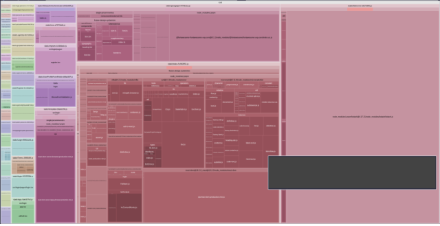
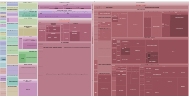
We can see some slight improvements in the updated bundle. Unfortunately the gains are fairly marginal at about 6%. The issue here is that we are still including the FontAwesome core library, which is pretty large. I had to look elsewhere for better improvements.
Lodash: Modernizing and downsizing
You might notice a very large chunk in our bundle now — lodash. While it is a handy utility library, it is problematic because it does not support tree-shaking.
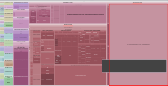
By replacing lodash functions with vanilla JavaScript equivalents and custom implementations, we should be able to trim down the bundle size significantly. The challenge here is that our theme pages and components are not directly using lodash, but some components being imported are. vite-bundle-visualizer is handy for finding our problematic components. After some digging, I found four components using lodash: Button, Icon, Dropdown and Overlay where Button is the main culprit, importing the other three components.
// Button.tsx

// before
import _ from "lodash";
if (onClick && _.isFunction(onClick)) {
    onClick(evt)
}

// after
if (onClick && typeof onClick === "function") {
    onClick(evt)
}
// Icon.tsx

// before
import _ from "lodash";
if (!_.included(getValidIconNames(), prefixedIconName) {
    // ...etc
}

// after
if (!getValidIconNames().includes(prefixedIconName) {
    // ...etc
}
// Dropdown.tsx
// before
import _ from "lodash";
menuItemClose = _.noop;
// after
menuItemClose = () => {};// Overlay.tsx
// before
import _ from "lodash;
resizeHandler = _.debounce(handleShow, 200);
// after
function debounce(callback: () => void, delay: number) {
let timeout: NodeJS.Timeout;
return () => {
clearTimeout(timeout);
timeout = setTimeout(cb, delay);
};
}
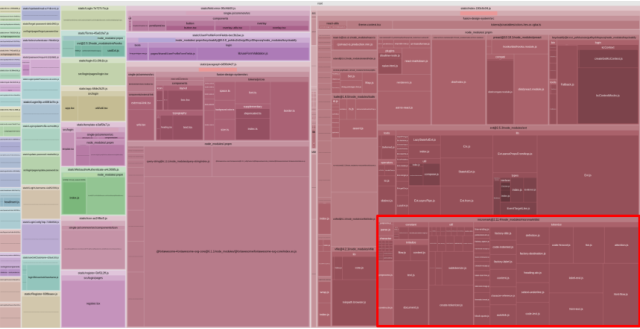
resizeHandler = debounce(handleShow, 200);With these changes made, we can see substantial improvement, in the order of ~400-450KB uncompressed! This amounts to around a 30% improvement.
React: Powerful, but big
Further scrutinization led me to an unavoidable reality — React itself constituted a substantial portion of the bundle.
In my time as a frontend engineer, I’ve heard about all sorts of alternatives to React. For this case I explored Preact, a smaller alternative with a comprehensive compatibility layer for React.
Using Preact is typically as simple as aliasing it in the build process by using @preact/preset-vite instead of the default React plugin for Vite. However in this case, I needed to do a few additional things because of the project structure. First, the theme is in a subdirectory of the larger Portal application — requiring some modifications to the default behavior of the plugin.
import preact from "@preact/preset-vite";
import path from "path";

// a hack to get the preact plugin working within this subdirectory
// https://github.com/preactjs/preset-vite/issues/56
const preactPatch = () => ({
    resolve: {
        alias: {
            "react-dom": path.resolve(
                __dirname,
                "./node_modules/preact/compat"
            ),
            react: path.resolve(__dirname, "./node_modules/preact/compat"),
        },
    },
});
const preactPlugin = preact();
preactPlugin[0].config = preactPatch;
Some module resolution errors for the preact/jsx-runtime package also needed some additional aliasing in the Vite config:
import path from "path";

export default defineConfig({
    // ...etc
    resolve: {
        alias: [
            // ... other aliases
            {
                find: "preact/jsx-runtime",
                replacement: path.resolve(
                    __dirname,
                    "./node_modules/preact/jsx-runtime"
                ),
            }
        ]
    },
    // ...etc
});
Lastly, installing a missing preact-render-to-string dependency resulted in a clean build.
The transition to Preact yielded unexpected but significant improvements, improving by approximately another 20% from the previous iteration. The cherry on top is that functionality remains the same! It is important to note that this is a fairly small app, so making this change is pretty safe. For larger projects, you should be careful to test for regressions when doing something similar.
Addressing subtle dependencies
Digging deeper, I unearthed hidden dependencies like micromark, impacting the bundle size.
Identifying and addressing such dependencies required a meticulous approach. Because it is not directly used by the theme in any way, we can use pnpm why micromark to find out what is actually importing it.
dependencies:
keycloakify 8.0.0
└─┬ react-markdown 5.0.3
     └─┬ remark-parse 9.0.0
          └─┬ mdast-util-from-markdown 0.8.5
               └── micromark 2.11.4
This revealed micromark as a sub-dependency of react-markdown, used in Keycloakify's built-in terms page. The terms page is used in the Fallback component provided by Keycloakify for cases where a page may not have been implemented. Replacing this fallback with a generic error page solved the problem.
After replacing the Fallback component, I found that the bundle size did not change; in fact, it increased a bit in size due to the new generic page. After more digging I found the Fallback component, being the default export of the keycloakify/login directory, was unintentionally imported in the themes context creator file. This is a bit of a pitfall of barrel files, but that is also a discussion for another time. A simple adjustment in import paths fixes it.
// before
import { createGetKcContext } from "keycloakify/login";
// after
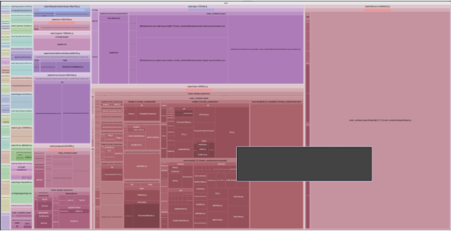
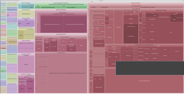
import { createGetKcContext } from "keycloakify/login/kcContext/createGetKcContext";Now, we can see the gains in our bundle
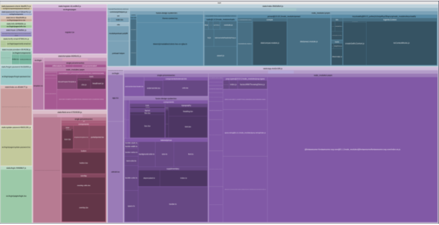
WOW, that was some serious improvement! The theme was importing much more than it needed to in that context creator file, meaning we removed a lot more than just micromark, and cut away an additional approximately 50% of the bundle size. By now, the bundle size is around 420KB uncompressed.
Lazy loading
With static analysis in a pretty good state, implementing runtime strategies to improve bundle size becomes important. Lazy loading is a great way to reduce runtime bundle size by only importing a module if it is being used.
import * as React from "react";

const Login = React.lazy(() => import("./pages/login"));
// ... other page imports

export default function ThemeApp({ kcContext }: { kcContext: KcContext }) {
    return (
        <React.Suspense>
            {(() => {
                switch (kcContext.pageId) {
                    case "login.ftl":
                      return <Login {...requiredProps} />;
                    // ... other cases
                }
            })()}
        </React.Suspense>
    )
}
When rendering the theme at runtime, only pages that are needed will be loaded. While not shown in the static analysis, this should improve what is actually loaded by the user when they visit the app.
Bundle comparison: Old vs. new
With some substantial gains on bundle size, we now need to compare it to our old theme. Before starting with this, I was fairly certain that it wouldn’t be able to beat the old theme’s size. The whole idea behind this project is to bring the DX of the theme as close as possible to the rest of the Cloud Customer Portal. The old theme used vanilla JavaScript with jQuery to add interactivity, and we want to be using React and TypeScript. The main goal was actually to make the increase in size as minimal as possible.
To measure our bundle load sizes, we’ll use Lighthouse. This will allow us to see what we’re actually loading in the process of loading our Keycloak theme. Because the Customer Portal is being loaded for both the new and old themes, we can leave it out of our comparison. The only difference here is the themes themselves, which add onto the load time of Customer Portal.
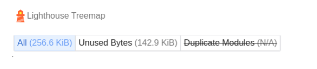
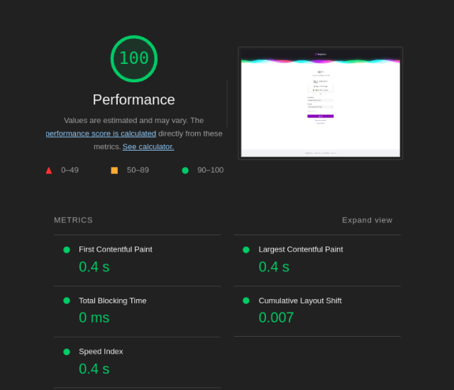
The old theme: Vanilla JavaScript + jQuery
Running the old theme in production through Lighthouse revealed a total bundle size of ~257KB uncompressed. The presence of core-js contributed significantly to this size, yet the overall Lighthouse score remained impressive.
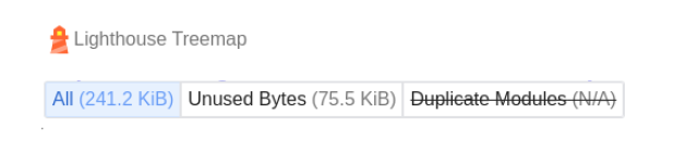
The new theme: TypeScript + React + Keycloakify
Testing the new theme in a staging environment yielded a bundle size of ~241KB uncompressed. Surprisingly, the new theme managed to outperform the old one by a few KB, showcasing the effectiveness of lazy-loading strategies.
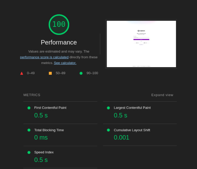
You may notice a marginal slowdown of the load time. This is expected because the new theme is being rendered by React (Preact), whereas the old theme was pre-rendered on the server side and simply displayed by the browser.
Conclusion
In conclusion, this blog post provides an in-depth exploration of the process undertaken to optimize our new Keycloak theme bundle. From the analysis using vite-bundle-visualizer to the optimizations involving internationalization stubbing, import improvements, lodash replacements and alternative library exploration, each step contributed to a more streamlined and performant application.
Starting at an uncompressed bundle size of around 1.8-2MB, we were able to reduce the bundle down to just over 400KB, amounting to around 23% of the starting size. Using lazy loading techniques, we further improved what actually gets loaded at runtime meaning the bundle the user gets, once decompressed, is only 241KB.
While this was a pretty small project in comparison to many web applications, and there are plenty of additional small improvements to be made, by sharing this journey, we hope to help others to implement similar strategies and techniques to improve their own web applications.