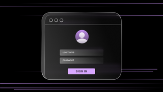
We at SingleStore want to provide a familiar and comfortable environment for our users, many of whom are accustomed to dark UI whilst working in their IDE. We recently finished a very successful hackathon, where I took on the project of implementing our long-awaited dark theme for the Singlestore Helios Portal UI. In this post, I will outline what it took to get this shipped to customers.
The Challenge
At SingleStore, we just recently finished our summer hackathon — which, if you don’t know, is where employees are free to work on whatever they want. We host two of these every year — one shorter period (about three days), at the start of the year, and a longer period, (about five days), mid-year. My goal for this year’s five-day hackathon was to ship a dark theme for our Singlestore Helios Portal React application. It's a project our team has desired and attempted multiple times —so myself and Jennifer Watts, the visual designer I paired up with for this task — were lucky enough to inherit all of the previous design work. That meant I could start the development work immediately, whilst Jennifer revisited previous design decisions and fleshed out any recognized gaps or insufficiencies.
The required development work can be broken down into the following tasks:
- Providing the logic and UI for getting and setting the applied theme in-app and in Storybook
- Extending our design tokens and migrating to CSS Custom Properties
- Conditionally switching between light and dark graphics
- Discovering edge-cases and collaborating with designers to decide on a solution
- Testing and quality assurance
The Implementation
Each user can select a theme preference which will be stored in their browsers' localStorage in one of three states: "light" | "dark" | "system". By default, "system" will be applied, which will look to the operating system or user agent for a preference using the `prefers-color-scheme` media query.
Our designers provide a dark variant with the same name and relative contrast for each of the base colors in our design system's existing color palette, e.g., color-purple-800, color-neutral-900, color-red-200, testing for accessible contrast between expected combinations. We also needed a reliable system for naming and classifying additional tokens.
To use these tokens in CSS, we declare and apply them as CSS Custom Properties (also known as CSS Variables), which are overridden whenever the class dark-mode is applied to the <body> element. We also generate TypeScript utilities for applying the tokens as either a reference to the associated CSS Custom Property, or the underlying primitive value (because some third-party libraries do not support CSS Custom Properties).
Then, we must touch and test every corner of our codebase to ensure that these tokens are applied in every relevant CSS declaration containing properties affecting color (color, background-color, border-color, box-shadow, fill, stroke).
To switch between our themed images, we create a React component that accepts an imageKey, rather than a src, pointing to a predefined dictionary that expects a lightComponent and darkComponent for every entry.
Providing an interface for working with our theme
First of all, we needed to provide the ability to get and set the current theme. We do this by wrapping our React app in a context provider that checks local storage for the user’s theme preference, makes the data available via a useTheme() hook and adds/removes the dark-mode class to the document’s body depending on that state.
import React from "react";
import { useLocalStorage } from "./hooks/use-local-storage";
import { useMediaQuery } from "./hooks/use-media-query";

const COLOR_SCHEME_QUERY = "(prefers-color-scheme: dark)";

export type ThemePreference = "system" | "light" | "dark";

export const ThemeContext = React.createContext<{
    theme: Omit<ThemePreference, "system">;
    themePreference: ThemePreference;
    setThemePreference: (theme: ThemePreference) => void;
}>({
    theme: "light",
    themePreference: "system",
    setThemePreference: () => {},
});

export function ThemeProvider({ children }: { children: React.ReactNode }) {
    const [themePreference, setThemePreference] =  useLocalStorage(
        "singlestore-ui-theme",
        "system"
    );
    const isOSDark = useMediaQuery(COLOR_SCHEME_QUERY);
    const systemTheme = isOSDark ? "dark" : "light";
    const theme = themePreference === "system" ? systemTheme : themePreference;

    React.useEffect(() => {
        if (theme === "dark") {
            document.body.classList.add("dark-mode");
        } else {
            document.body.classList.remove("dark-mode");
        }
    }, [theme]);

    return (
        <ThemeContext.Provider
            value={{ theme, themePreference, setThemePreference }}
        >
            {children}
        </ThemeContext.Provider>
    );
}

export function useTheme() {
    const context = React.useContext(ThemeContext);

    if (context === undefined) {
        throw new Error("useTheme must be used within a ThemeProvider");
    }

    return context;
}Conditionally switching between light and dark-themed images
We have a centralized component for rendering our more complex, now-themed SVGs, so I simply had to export the dark image variant files to the codebase and add them to an object within the component.
import SVGSchemaLight from './svg/schema.svg';
import SVGSchemaDark from './svg/schema--dark.svg';
import SVGTableLight from './svg/table.svg';
import SVGTableDark from './svg/table--dark.svg';
...
export function ComplexSVG(props) {
    const { theme } = useTheme();

    const allComplexSVGs = {
        schema: {
            lightComponent: SvgSchemaLight,
            darkComponent: SvgSchemaDark
        },
        table: {
            lightComponent: SvgTableLight,
            darkComponent: SvgTableDark
        },
        ...
    };

    ...

    const { lightComponent, darkComponent } = allComplexSVGs[props.imageKey];

    return theme === 'dark' ? darkComponent : lightComponent;
}
Revising our design tokens and component library
We had recently started to revise how we classify, maintain and distribute our design tokens and their dependent assets. In fact, the impact of that work is what drove my initial desire to take on the task of implementing our dark theme in this hackathon. Particularly supportive changes were:
- The declaration and increased adoption of CSS Custom Properties to replace our Sass variables
- Adopting a multi-tiered system for classifying our design tokens
- Using "variant props" to apply typed classes to reusable UI components
- Using style-dictionary to centralize our tokens in JSON and generate multiple synchronized formats for accessing our design tokens
Let's dig deeper into some of these changes.
Naming and classifying design tokens
Inspired by this great article, we classified our design tokens as having three tiers (which I'll explain using color tokens, but can be relevant to all types of design tokens). This "tiered" system allows us to gracefully maintain multiple themes as well as any edge-cases, like when the background is dark in both light and dark mode).
Tier 1
:root {
  --sui-color-base-neutral-200: #f3f3f5;
  --sui-color-base-red-900: #c41337;
}

.dark-mode {
  --sui-color-base-neutral-200: #221f26;
  --sui-color-base-red-900: #eb4258;
}
These are the lowest-level tokens that can be thought of as the primitive values that make up our entire set or palette. They never reference another token and were the most used tier of tokens prior to implementing dark mode. We chose to override each Tier 1 token’s CSS Custom Property with a dark value, which meant that a significant amount of our UI that already used these Tier 1 tokens would already be themed.
Prior to this, our app only provided one theme, and we could get away with hard-coding primitive CSS values. As a result, the existing tokens were not used 100% of the time — and most, that were used, did so via Sass variables, which wouldn't be reassigned when the theme changes. To add a second, dark theme, we needed 100% CSS Custom Properties usage for at least our color-related declarations,. However we could not start converting the codebase over just yet, as Tier 1 tokens alone would not get us all the way.
What if a UI element has a dark background in both light and dark themes? Adding to that, these Tier 1 tokens' names do not give much indication of their purpose. Can the color "base-red-900" be used for backgrounds, text, and borders? Well, we can start to simplify and standardize these decisions by defining additional layers of tokens with more prescriptive names that are alias to our low-level tokens.
Tier 2
:root {
  --sui-color-text-neutral-3: var(--sui-color-base-neutral-900);
  --sui-color-background-neutral-inverse-1: var(--sui-color-base-neutral-0);
  --sui-color-border-purple-1: var(--sui-color-base-purple-600);
}
Tier 2 tokens exist to give creative power to contributors by further expanding our Tier 1 tokens into more meaningful categories. I search through every declaration that set any color-affecting CSS property, which include:
color,backround-color,fill,stroke,border|border-color|border-top-coloretc…box-shadow.
This resulted in me defining Tier 2 tokens for background, text, and border colors in order of contrast, 1 always being the lowest contrast against the background-color of <body>. These tokens indicate where they should be used, providing guardrails, and allowing contributors to make UI design decisions with less effort and more confidence.
When applying a background-color, we know to use color-background-* and that any color-text-* and color-border-* colors will pair with it in an accessible way. If we want the low-contrast gray text, we can start with color-text-neutral-1 and work our way up as needed. Over time, we start to remember patterns, such as that color-text-neutral has 3 steps and so to use color-text-neutral-3 for high-contrast text, and that color-border-red only has 1 step, so use color-border-red-1 whenever we require a red border.
But this still doesn't help us manage edge cases where a specific UI element has a dark background in both light and dark themes. To do this, we must declare more specific Tier 3 tokens.
Tier 3
:root {
  --sui-component-help-menu-header-background-color: var(--sui-color-background-neutral-inverse-2); // dark background with high contrast against the HTML document's white  background
}

.dark-mode {
  --sui-component-help-menu-header-background-color: var(--sui-color-background-neutral-3); // dark background with slight contrast against the HTML document's dark  background
}
These tokens are so specific that they are often used in just a single declaration (although they can be reused). Themes can override these tokens to target specific properties of a specific component in a specific state. This is most useful for us when a different Tier 2 token is used in our light theme than our dark theme, or when using a unique primitive CSS value not found anywhere else in the codebase.

Discovering code derived from design tokens
Now we have our design tokens available as CSS Custom Properties that can change dynamically with whichever theme is applied, which is great!
Although, we still do not have everything we need. We do not yet have a method for accessing our tokens in TypeScript files in a type-safe way. And not only do we need the ability to access a token's representative CSS Custom Property, but also to access its underlying, primitive CSS value to work with some of our third-party libraries that do not support CSS Custom Properties.
On top of that, we want to declare reusable CSS utility classes to apply common rules, some of which are derived from our set of design tokens. How do we type components that make use of these utility classes? And, better yet, how do we keep all of this synchronized over time?
Before I get into how we keep our design-token-derived code synchronized, let's look at the code and why it’s important.
Utility classes that apply design tokens
Utility classes provide a great developer experience, allowing us to move quicker and reduce the amount of micro-stylesheets we create. For this reason, we want the ability to apply our most common styles this way. We see value in having a utility class for every Tier 2 color token, but feel no need to do the same for Tier 1 and 3 color tokens — since we don’t want to encourage the use of Tier 1 tokens, (which lack descriptive names), and Tier 3 tokens are usually too specific to warrant a reusable utility class.
.sui-u-color-neutral-1 {
    color: var(--sui-color-text-neutral-1) !important;
}

.sui-u-background-color-neutral-1 {
    color: var(--sui-color-background-neutral-1) !important;
}

.sui-u-border-1px-solid-neutral-1 {
    border: 1px solid var(--sui-color-border-neutral-1) !important;
}

.sui-u-border-top-1px-solid-neutral-1 {
    border-top: 1px solid var(--sui-color-border-neutral-1) !important;
}

.sui-u-border-right-1px-solid-neutral-1 {
    border-right: 1px solid var(--sui-color-border-neutral-1) !important;
}

.sui-u-border-bottom-1px-solid-neutral-1 {
    border-bottom: 1px solid var(--sui-color-border-neutral-1) !important;
}

.sui-u-border-left-1px-solid-neutral-1 {
    border-left: 1px solid var(--sui-color-border-neutral-1) !important;
}
This is great because it reduces our need to create new CSS rules/files to apply simple styles. For clarification, however, we aren’t taking a “utility-first” approach, as something like Tailwind does. I look at it like this — the 80/20 principle would suggest that ~20% of CSS declarations make up ~80% of the application styles. We’re just finding and providing that 20%.
A common criticism of utility classes, and one that I agree with, is that they pollute the source code with long strings of utility classes. Applying these strings directly to a component’s className prop is also untyped. So next, let’s look into how we apply these utility classes in a way that is both typed and easier to read.
Typed styling props using Class Variance Authority
We've had great results providing typed style variant props to our reusable UI components using class-variance-authority. But what are style variant props?
Simply put, style variant props (or just "variant props") are component props that apply classes to and style DOM elements when certain conditions are true. A common example of this is a Button component:
<Button
  variant="primary" // applies ".sui-c-button--variant-primary"
  size={2} // applies ".sui-c-button--size-2"
  disableMotion // applies ".sui-c-button--disableMotion"
>
    I'm a button
</Button>
We also use this pattern to apply lower-level utility classes:
// applies ".sui-u-background-color-neutral-1", which applies "background-color: var(--sui-color-background-neutral-1)"
<Flex backgroundColor="neutral-1" />


// applies ".sui-u-color-neutral-1", which applies "color: var(--sui-color-text-neutral-1)"
<Paragraph color="neutral-1" /> 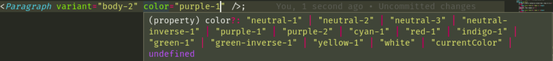
The logic behind the color prop of the preceding component is another example of code that we need to keep in sync with the design tokens. Under the hood, using class-variance-authority, this looks like so:
const textVariants = {
    variant: {
        "body-1": "sui-c-text--variant-body-1",
        "heading-1": "sui-c-text--variant-heading-1",
        ...
    },
    color: {
        // We want to keep these in-sync automatically
        "neutral-1": "sui-u-color-neutral-1",
        "neutral-2": "sui-u-color-neutral-2",
        "neutral-3": "sui-u-color-neutral-3",
        "red-1": "sui-u-color-red-1",
        "green-1": "sui-u-color-green-1",
        …
    }
}

const textVariantsKeys = Object.keys(textVariants) as Array<keyof typeof textVariants>;

const text = cva('sui-c-text', {
    variants: textVariants
})

export function Paragraph(props) {
    const { className, ...rest } = props
    const [variantProps, elementProps] =  split(rest, textOwnVariantPropKeys);

    return (
        <p
            className={text({ ...variantProps, class: className })}
            {...elementProps}
        />
    );
}
Accessing a token's value in TypeScript files
In TypeScript, we need the ability to access our tokens in multiple ways:
- As a CSS Custom Property
var(--sui-color-background-purple-1) - As its underlying primitive value in light mode,
#f9edff - As its underlying primitive value in dark mode,
#22102b
Which looks like so:
export const COLORS = {
    "base-neutral-0": "var(--sui-color-base-neutral-0)",
    "base-neutral-100": "var(--sui-color-base-neutral-100)",
    "base-neutral-200": "var(--sui-color-base-neutral-200)",
    ...
    "text-neutral-1": "var(--sui-text-neutral-1)",
    "background-neutral-1": "var(--sui-background-neutral-1)",
    "border-neutral-1": "var(--sui-border-neutral-1)",
    ...
};

export const LIGHT_HEX_COLORS  = {
    "base-neutral-0": "#ffffff",
    "base-neutral-100": "#fafafa",
    "base-neutral-200": "#f3f3f5",
    ...
    "text-neutral-1": "#777582",
    "background-neutral-1": "#ffffff",
    "border-neutral-1": "#e6e5ea",
    ...
}

export const DARK_HEX_COLORS {
    "base-neutral-0": "#151117",
    "base-neutral-200": "#221f26",
    "base-neutral-100": "#1c181f",
    ...
    "text-neutral-1": "#858191",
    "background-neutral-1": "#151117",
    "border-neutral-1": "#29262e",
    ...
}
Accessing a token value as a CSS Custom Property
In our app, we use a code syntax highlighting library that allows us to pass through a theme object to customize the UI it renders. We use the COLORS object here to access a token’s representative CSS Custom Property as a string.
import { Highlight } from 'third-party-library’;
import { COLORS } from 'singlestore-ui/tokens';

const theme = {
    plain: {
        backgroundColor: COLORS['background-neutral-1'], // "var(--sui-color-background-neutral-1)"
        color: COLORS['text-neutral-3'] // "var(--sui-color-text-neutral-3)"
    }
};

...

export function CodeBlock(props) {
    ...
    return (
        <Highlight
            theme={theme}
            code={props.code}
            language={props.language}
            ...
        />
    )
}
Accessing a token value as its primitive value
The next example shows our usage of a third-party library that renders an `iframe', where customization is applied by passing a CSS-in-JS object through props. Because this is an iframe, our CSS Custom Properties are not available in the embedded document — so we must pass our tokens as primitive CSS values.
import { PaymentMethodIframe } from "third-party-library-without-css-custom-properties-support";
import { DARK_HEX_COLORS, LIGHT_HEX_COLORS } from "singlestore-ui/tokens"

export function BillingForm() {
    const { theme } = useTheme();

    let themedInputStyles;

    if (theme === 'dark') {
        themedInputStyles = {
            backgroundColor: DARK_HEX_COLORS['background-neutral-3'],
            color: DARK_HEX_COLORS['text-neutral-3'],
        }
    } else {
        themedInputStyles = {
            backgroundColor: LIGHT_HEX_COLORS['background-neutral-3'],
            color: LIGHT_HEX_COLORS['text-neutral-3'],
        }
    }

    return (
        <PaymentMethodIframe
            inputStyles={{
                ...themedInputStyles
            }}
        />
    )
}
Generating code derived from design tokens using Style Dictionary
Now that we’ve seen all the code that references our color design tokens, let’s get into how we keep it all synchronized. If we were to modify or extend these design tokens, we may need to touch *dozens*, maybe even ***hundreds***, of lines of code for even simple changes. This clearly does not scale, and leaves plenty of room for human error. So, we need a way to automatically generate this code for us. And this is how we landed on Style Dictionary. Here’s an excerpt from their website that accurately describes its utility:
“Style Dictionary is a build system that allows you to define styles once, in a way for any platform or language to consume. A single place to create and edit your styles, and a single command exports these rules to all the places you need them.”
This allows us to define our tokens in a centralized JSON object and then define “formats", “filters” and “transforms” (i.e JavaScript functions) to generate code derived from it.W e won’t dig deep into our implementation of this tool, but rather give an overview of what this process looks like. Here is what our token source files look like:
singlestore-ui/tokens
├── border
│   └── base.js
├── colors
│   ├── base.js
│   └── dark.js
├── font
│   └── base.js
├── sizes
│   └── base.js
├── space
│   └── base.js
└── tokens.utils.js
```

```
// singlestore-ui/tokens/color/base.js
module.exports = {
    color: {
        base: {
            neutral: {
                900: { value: "#1b1a21" },
        ….
            },
            purple: {
                900: { value: "#8800cc" },
        ….
            },
    ….
        },
        text: {
            "neutral-1": { value: "{color.base.neutral.700}" },
    …
        },
        background: {
            "neutral-1": { value: "{color.base.neutral.0}" },
    …
        },
        border: {
            "neutral-1": { value: "{color.base.neutral.300}" },
    …
        },
    },
};
I then wrote the script that defines our different formats, which filter and iterate over tokens to output the files we need. Now, the rest of our codebase can import and use these assets — and whenever we ever add, remove or modify tokens, running this script, pnpm run style-dictionary:build, does much of the heavy lifting for us.
singlestore-ui/tokens/__generated__
├── background-color-utility-classes.css
├── background-color-utility-variants.js
├── border-color-utility-classes.css
├── border-color-utility-variants.js
├── border-radius-utility-classes.css
├── border-radius-utility-variants.js
├── border-variables.css
├── color-variable-map.js
├── color-variables.css
├── dark-hex-color-map.js
├── font-utility-classes.css
├── font-utility-variants.js
├── font-variables.css
├── light-hex-color-map.js
├── size-utility-classes.css
├── size-utility-variants.js
├── size-variables.css
├── space-utility-classes.css
├── space-utility-variants.js
├── space-variables.css
├── text-color-utility-classes.css
└── text-color-utility-variants.js
Conclusion
That was most of the development work that went into shipping a dark theme for the Singlestore Helios Portal UI. After extensive testing, I shipped it to customers and passed it over to the QA team for another round of testing. We’re all very pleased with the end result of this hackathon project, and we hope you are too!
My final thoughts around this subject are of appreciation for how far our browsers have developed. CSS Custom Properties now being supported in all modern browsers actually made implementing the logic for dark mode fairly simple, and I’m pleased to have had an opportunity to use them and see the benefits they bring.
Further Reading